What do you want your brand to say? What do you want it to look like? Who buys your products or uses your services? Why?

Every organization has a “Why” that is the essence of their brand. During a rebrand, we try to figure out what every organizations “why” should look like in the eyes of the consumer.
Every rebrand is different, and should be treated as such. That’s why here at Sokal we try to get to know every client to gauge an accurate representation of their “why.”


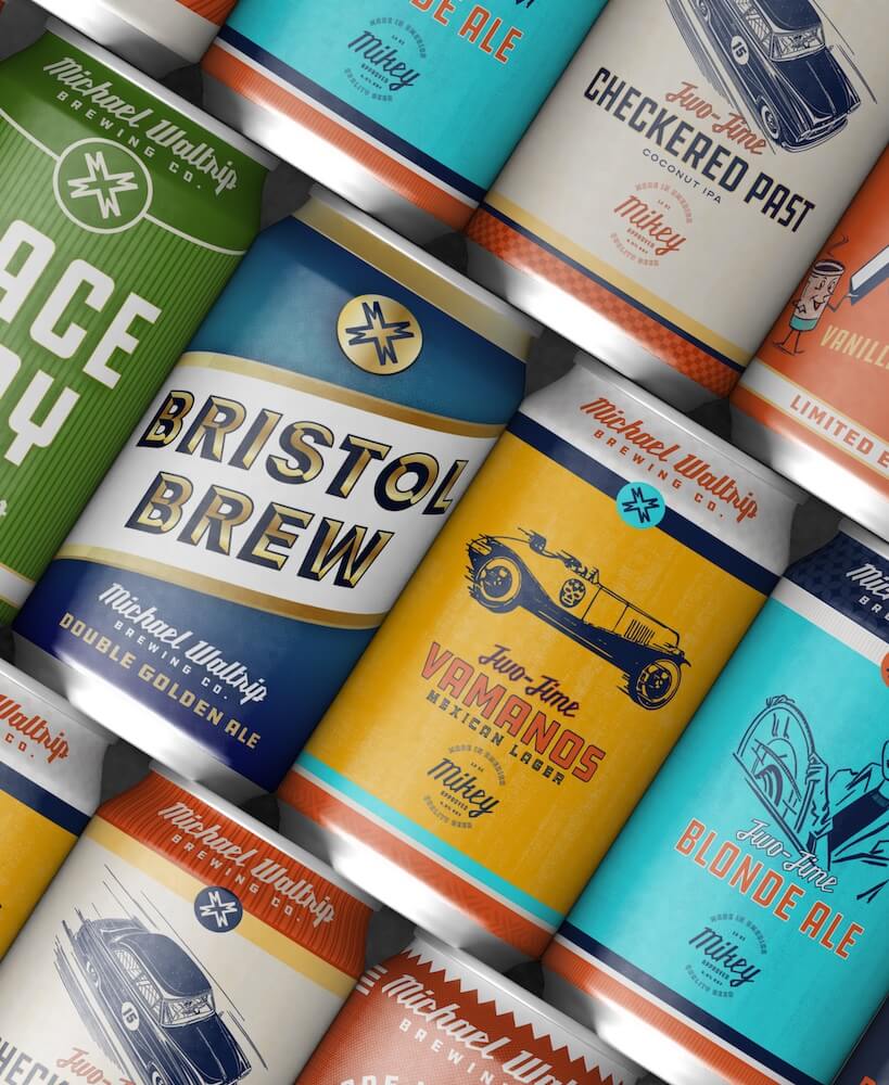
Anything can become an illustration. Anything can become the face of your brand. Our in-house design team has created some amazing illustrations for clients that are from all different backgrounds.
From gas station snacks to beer can designs, illustrations can label and become a key identifier for your company.

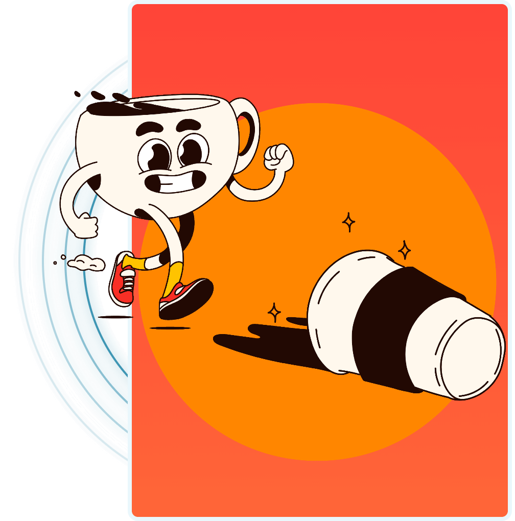
Adding a face to products has gone on for centuries with celebrity endorsements and spokespeople for all different companies. But what if your “face” never aged? Never left? Never changed, unless you wanted it to of course.
An illustration can be the ultimate face of a brand because it’s long lasting, and there are many well known brands with this same logic.
A big part of a full rebrand is also figuring out: what was your brand doing before? What did you like about it? What did you not like?
These are all questions to think about and that we actively try to figure out during the creative analysis process.
